Author: Me
One on One with JB Holston of NewsGator
From this article in Fierce Content Management… (Source)
The market has moved very rapidly. The preponderance of the Global 2000 have structured enterprise social initiatives today. Organizations see changing their collaboration paradigm from document- or artifact-centricity, to people-centered, as a vital competitive advantage. Companies talk to us about their need to ‘roll out the social fabric’ as broadly and quickly as possible. They understand that their workforce now expects to work that way, and that the advantages to ‘social’ increase exponentially as a function of the number of people who have access to the capability.
“The difference between fiction and reality? Fiction has to make sense.”
Windows 8 Installed in Lab
I’ve been curious about getting to experience the “metro” UI in Windows 8, so with the consumer preview now available for download, I didn’t waste any time getting it running in the lab. Now granted it will be the desktop experience through a VM with no touch experience, but alas, isn’t that the point of a unified interface?
Installation from the 64-bit ISO image into VMware Fusion 4.1.1 on MacOS 10.6 was uneventful. After the obligatory interrogation for personal information (including birthdate) and registration with Microsoft (no doubt to primarily power the Store), things went as expected until I arrived at the tiles. After dropping into a full screen experience of Internet Explorer, it took me a second to figure out how to get back (Control-Escape). That and the horizontal scroll were a little disorienting.
I’ll need some more time to write a review of any length, but for now a couple screen shots of note including the home screen (at top), full screen Internet Explorer and the Store <images missing>.
“Luck is the residue of design.”
My Outlook Divorce & Return to Paper
Perhaps it was the start of a new year or more likely the onslaught of work that hit me the day I returned from holiday, but I had an epiphany. I was being far too reactive. Why was that? I have a highly efficient process that I’ve honed after living in Microsoft Outlook for over a decade. I’m obsessive about my calendar (managed in 15 minute increments and with blocks for work and travel time) as well as achieving zero inbox on a weekly basis–much to the chagrin of my staff when the flurry of resulting emails happens on a Friday afternoon. Yet, it became apparent to me that my professional life was being dictated by what fell into my inbox and showed up on my calendar. External stimuli.
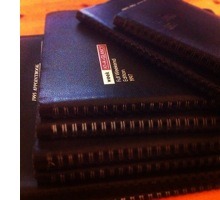
 Around the same time, I happened to come across a collection of my old datebooks from the 1990’s. I was always organized about my time and began using them in high school and through college until I got my first corporate gig which included, you guessed it, Outlook. I’m glad that I held on to them, fascinated I suppose with the idea of being able to say exactly what I was up to on a given day decades ago. Who knows, maybe they’d come in handy for my memoirs or for some future biographer when I hit it big. In any case, it was a stroke of luck that I came across them about this time.
As I flipped through the assortment, noting how much life was dominated by tests and homework, I remembered there was always one that I really liked. It’s had a great large format, pleasing layout, thicker paper and good typography. It was perfect bound but able to lay open flat. It was different from the others, which were mostly medium sized “Week At-A-Glance” full weekend editions by Keith Clark with their black vinyl covers and metal spiral binding. It wasn’t in the pile, but being larger than the rest I hoped it was just somewhere else in the storage trunk. I went frantically digging and was pleased to find it.
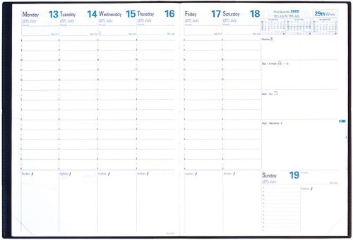
 Having no recollection of the brand, I discovered it was a “Quo Vadis Prenote 24 Agenda Planning Diary” from 1994 with brown print and a black vinyl cover. It shows the whole week with columns for each day except Sunday, which is squished into a small box–I hate it when they do that. It’s 8.25 x 11.5 (in contrast to the 6.75 x 8.75 “At-A-Glance” size which happen to have full Sundays, probably the reason I switched to them) with plenty of room for daily and weekly notes.
So the next question was, do they still make these? A quick internet search found them and I was stoked. Looks like they’ve changed the typography and color palate (for the worse, sadly) but the format remains largely the same. A quick trip to an online specialty office supply store and I had one on the way ($28.44 with shipping).

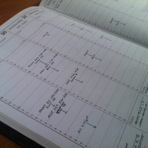
So what makes these so special? It’s actually the experience of using it and the planning process it encourages. Unlike my Outlook inbox or calendar, nothing randomly shows up, I have to choose to write it in. I engage my muscle memory when writing. I become more intimate with the item I’m writing about (whether a priority, to do or appointment). This particular planner has more than just space for appointments. It has space for weekly priorities (if you repurpose the boxes on the far right) and a box for the top priorities of each day. It encourages you to think about what’s most important (or “dominant” as the 1994 version called it). It’s always providing tidbits of data like how many days or weeks remain the in the year, reminding you of the big picture.
Now I realize that with some configuration and discipline, I could make Outlook (or iCal for that matter) conform to a similar layout. But I would still loose control of what shows up. I wouldn’t get the tactile experience of writing in the book or the resulting muscle memory. Instead, I would get a backlit experience on an iPad or computer monitor during those quiet times early in the morning or late at night when natural light on paper is more contemplative (or worse, toner on loose sheets of stark white paper with horrifying typography should I conform to one of Outlook’s barely customizable print layouts).
So after a decade, we’ve divorced and I’ve found someone new. Outlook is no longer my planner. It is an input to my planner. I’m never going to avoid the flood of email or the daily meeting marathon with constantly shifting appointments that is a fact of corporate life. But by putting space between that chaos and what I write in my planner, I’m afforded the chance to consider what’s most important. To think about the rhythm of a day or a week. To be a little less quick to change priorities when something “urgent” comes in (after all, I have to actually spend a few seconds with a pencil eraser to make changes instead of just clicking a mouse).
How have the results been? Well, it’s only been two weeks so it’s difficult to factor out the potential novelty factor, but I can say with confidence I’ve been more productive. Setting daily priorities that have to fit into a 1 inch box have really made me think about what’s most important. You can only really write 2 or 3 things in there, which is usually about right for significant items. Most importantly, I enjoy the experience. It produces a more contemplative mood which I believe will lead to better planning. The muscle memory from handwriting has gotten me closer to the details of each day, and I find I actually refer to the page less because of it. I can let Outlook be Outlook and not get frustrated by trying to bend it to my needs. And, I’ll have something I can look at decades from now to see exactly what I was up to in 2012.
“I criticize by creation – not by finding fault.”


