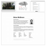
More grid fun over at brianmcbreen.com.
Tag: Design
Photo from The Airstream Life featured in Dwell. Landscape architect Andreas Stravropoulos of XS LAND uses a mobile studio for client work.
This notice from Twitter about their new Retweet feature gave me a chuckle based on the RT it highlighted.
New Blog Theme & Website Design
Just putting the finishing touches on the new design for the parent site, brianmcbreen.com, and this corresponding Tumblr blog theme (based on the original Swiss Theme by pixelspread).
On the parent site, I integrated tags and the most recent blog post via RSS, albeit with some compromises due to iWeb (which I use mostly for convenience). I did discover this clever way of using grids in the background for precise design, a practice I had longed for in iWeb.
In the blog theme, I made several changes to the CSS and added support for tags and comments through Disqus. I’m sure I’ll do some fine tuning to the layout and as always come across some minor bugs, but for now I’m happy enough to let it live for a little bit. It seems I get restless with the design every few months as those who visit the site often can attest.
What do you think?
IKEA Changes Fonts, Outrage Ensues
IKEA Changes Fonts, Outrage Ensues
After brewing on Twitter and on typography and design blogs for the last couple weeks, the New York Times picked up the story about how IKEA has replaced the venerable font Futura with Microsoft’s Verdana screen font.
Yet it can’t be denied: Ikea is trading away a font with a tradition of modernist design, having elaborate associations, for one that has only one major association: with the computer screen. This is so offensive to many because it seems like a slap at the principles of design by a company that has been hailed for its adherence to them. It is, detractors say, an embrace of homogeneity and globalization, betraying all allegiance to the Ikea warehouse style that coats its version of modernity with a veneer of Swedish idiosyncrasy.
I’ll be curious to see how IKEA reacts, beyond press statements. If you are known for good design, things like this matter.
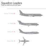
Click through for the full graphic: Reduce Your Chances of Dying in a Plane Crash by David McCandless of Information is Beautiful.
Visualization of my Facebook friend network from Nexus. It’s fascinating to see the groupings and connectors among these friends.
(thanks @DougStanley14)
Scott McCloud Podcast Interview
Scott McCloud Podcast Interview
He mentions Edward Tufte among his influences; good discussion about visual expression and narrative.
